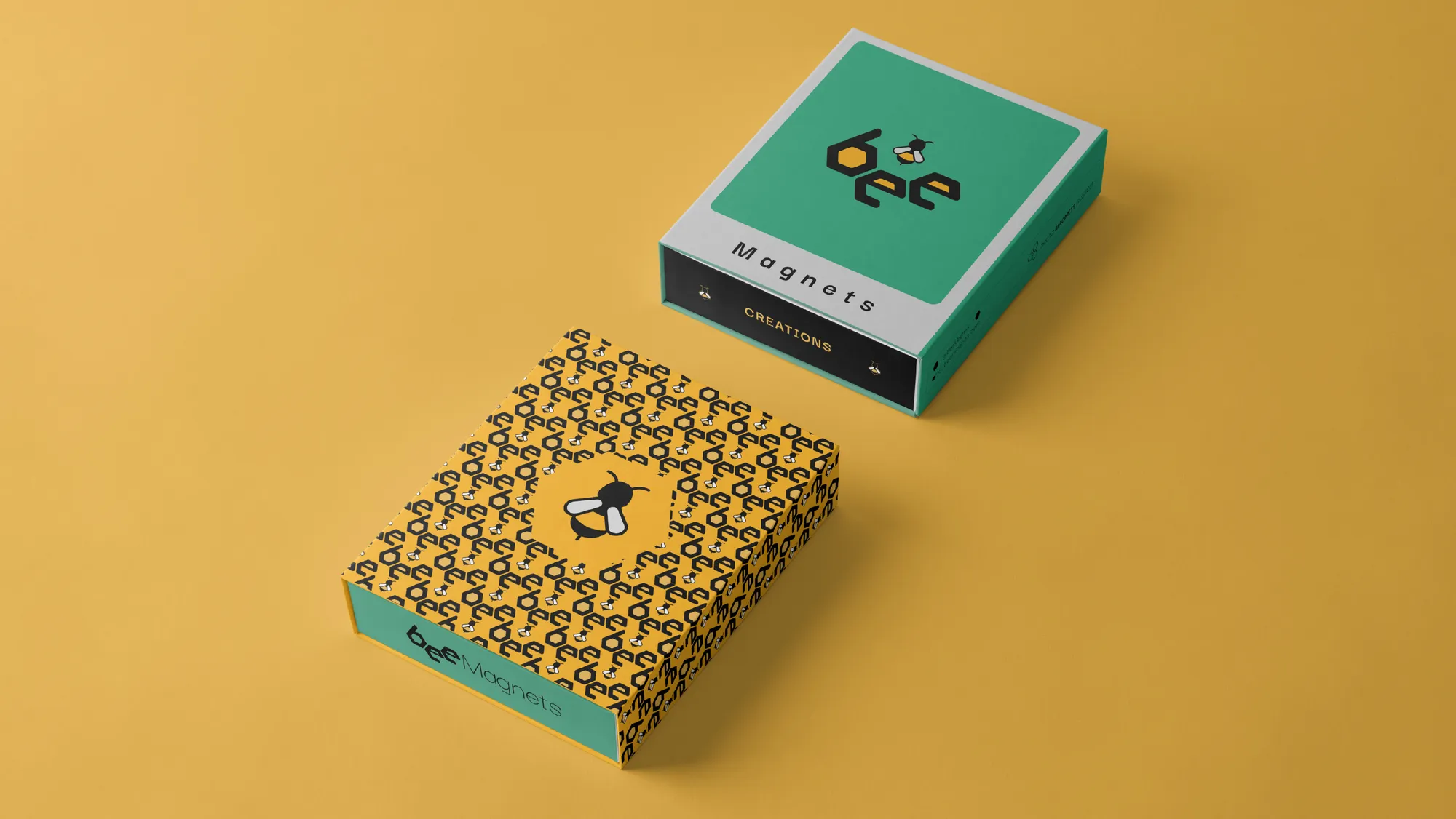
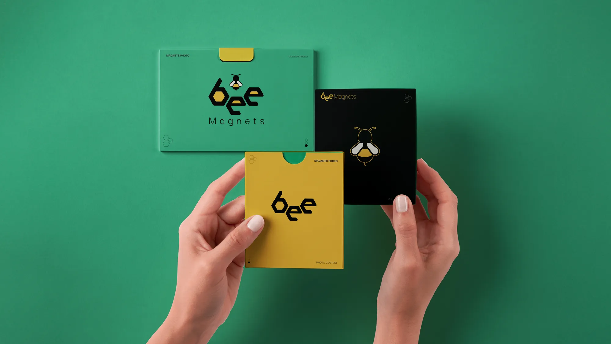
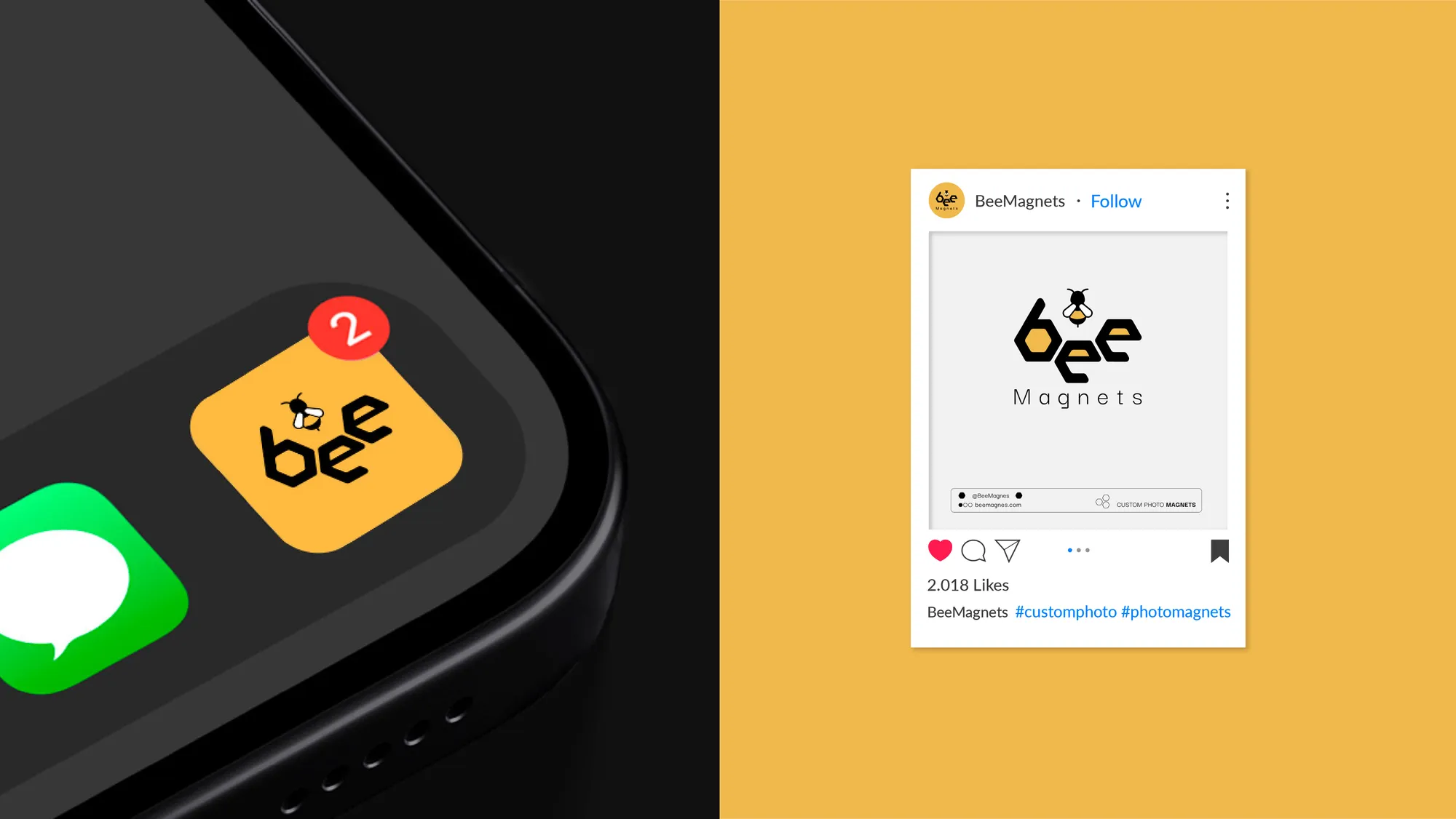
Bee Magnets is a Toronto company specialising in custom magnetic photos. The goal was to design a visual identity that reflects the creativity and the unique personalisation Bee Magnets offers its customers.
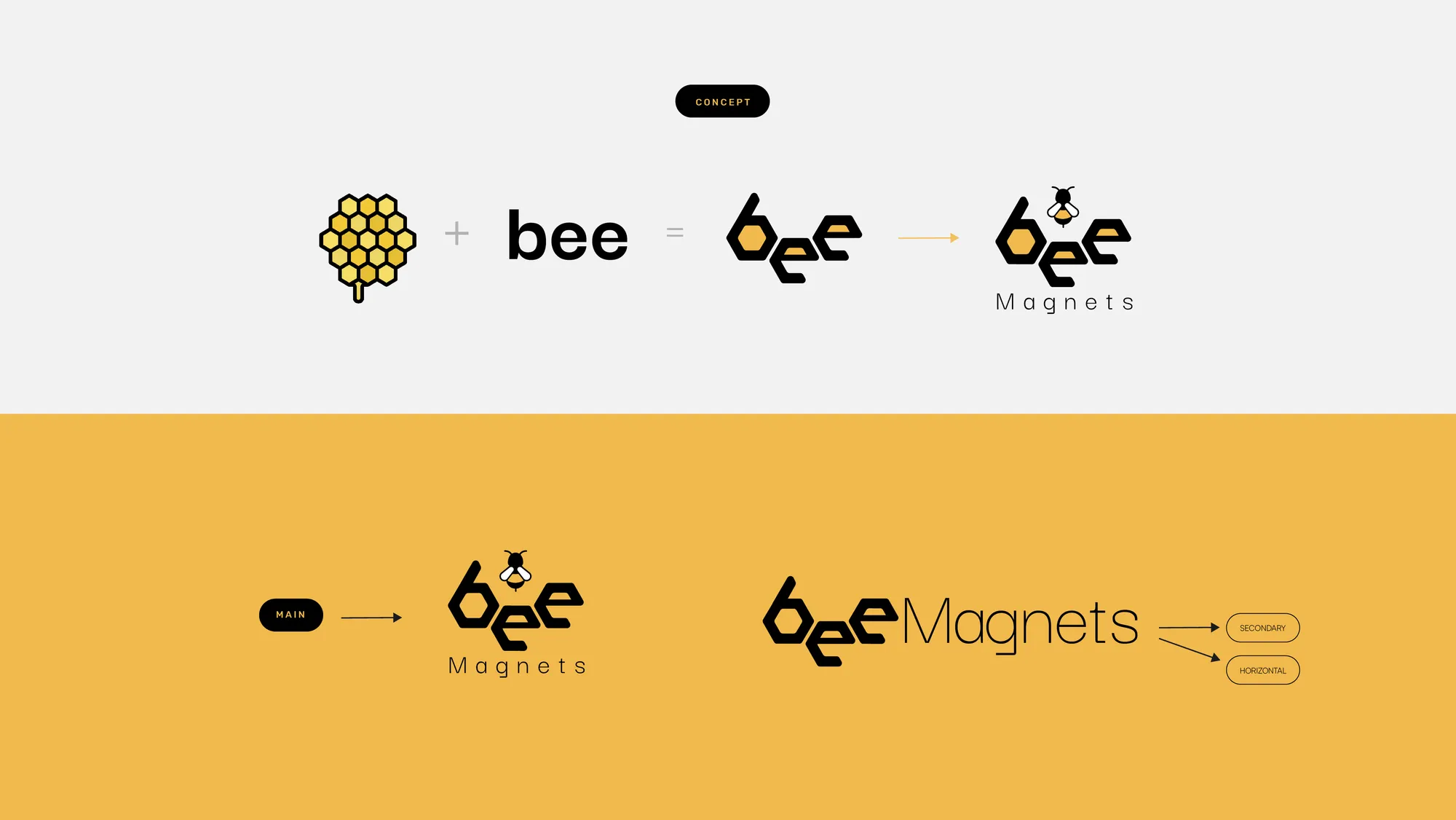
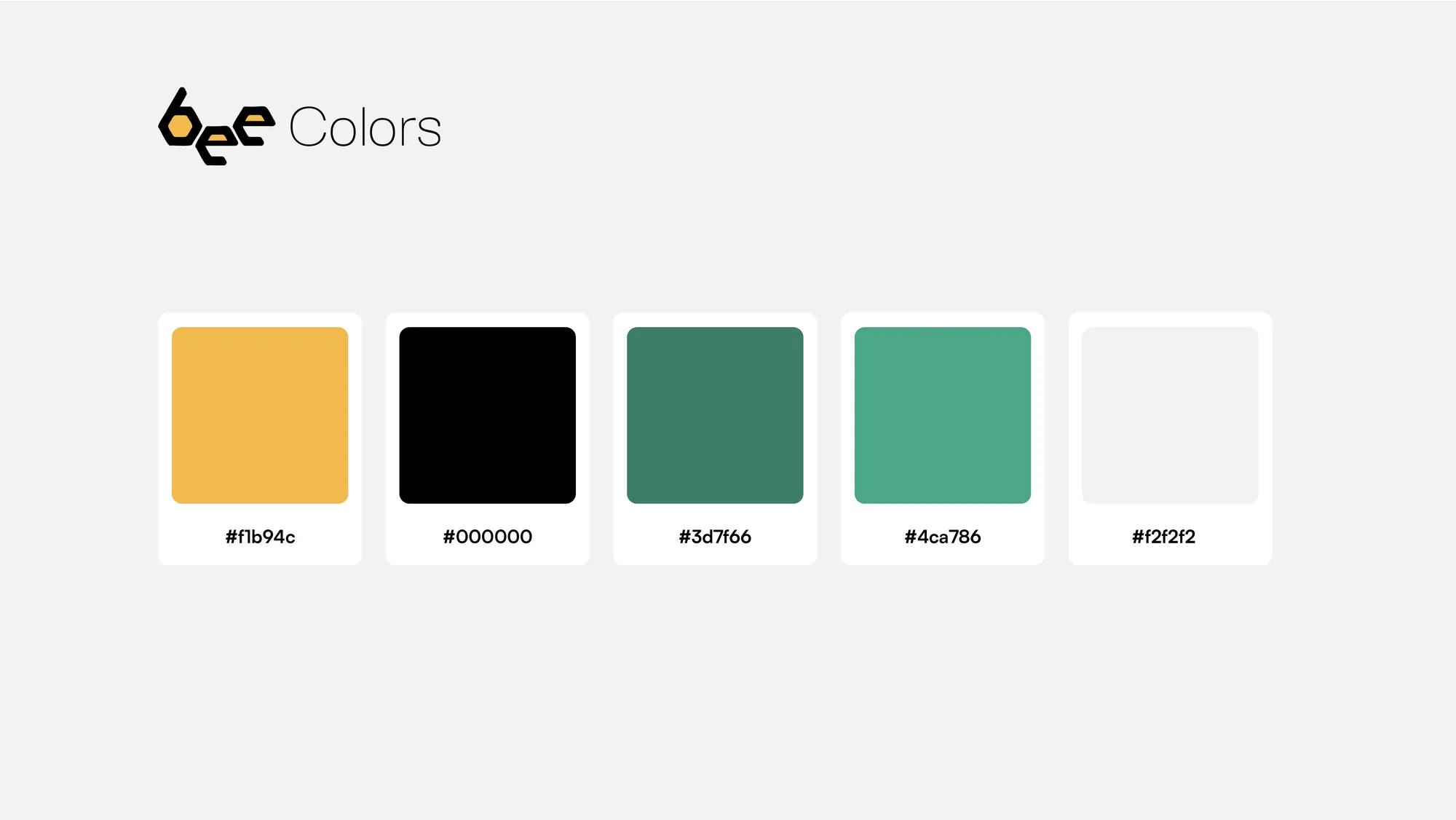
The logo drew on the bee, a symbol of community and efficiency. The colour palette, built from vibrant, warm tones, conveys joy and energy, in line with the brand's mission of capturing special moments and turning them into tangible keepsakes.
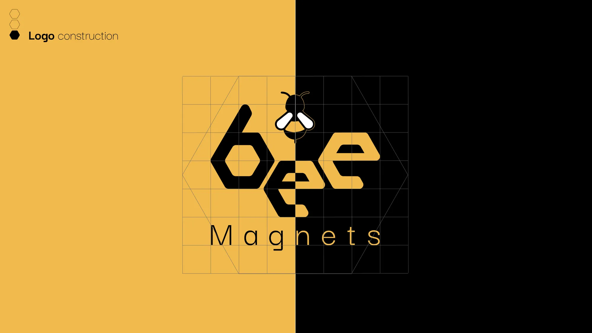
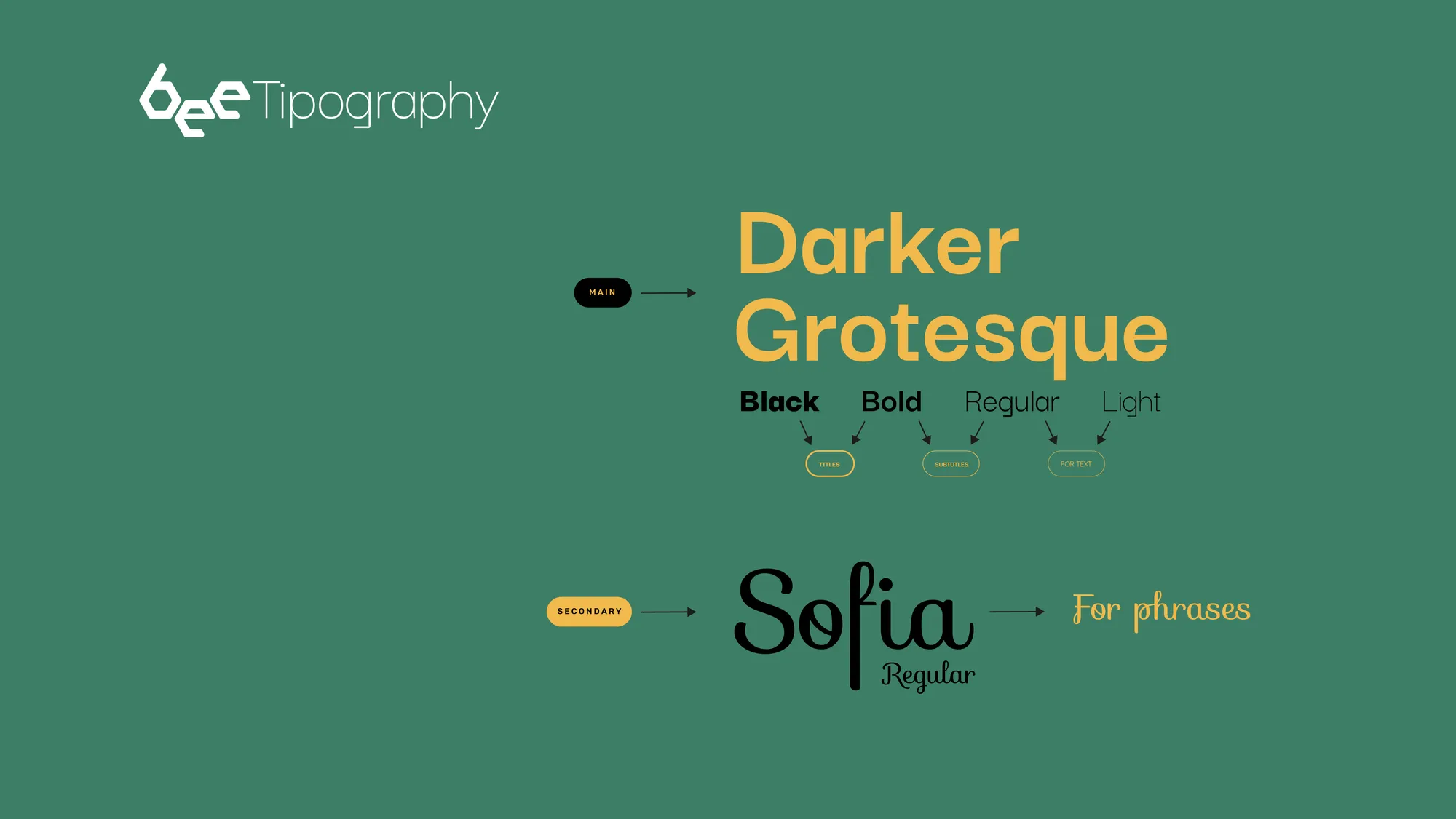
The typography is modern and friendly, inspired by honeycombs to give the brand a distinctive, playful touch.